Almara Restaurant
branding
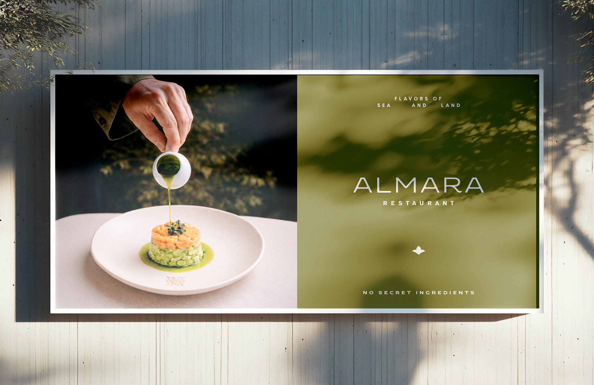
Almara is a Mediterranean-inspired brand built around the idea of calm, connection, and sensory experience. We developed a visual identity that translates this concept into a refined and contemporary brand system, balancing elegance, warmth, and simplicity.

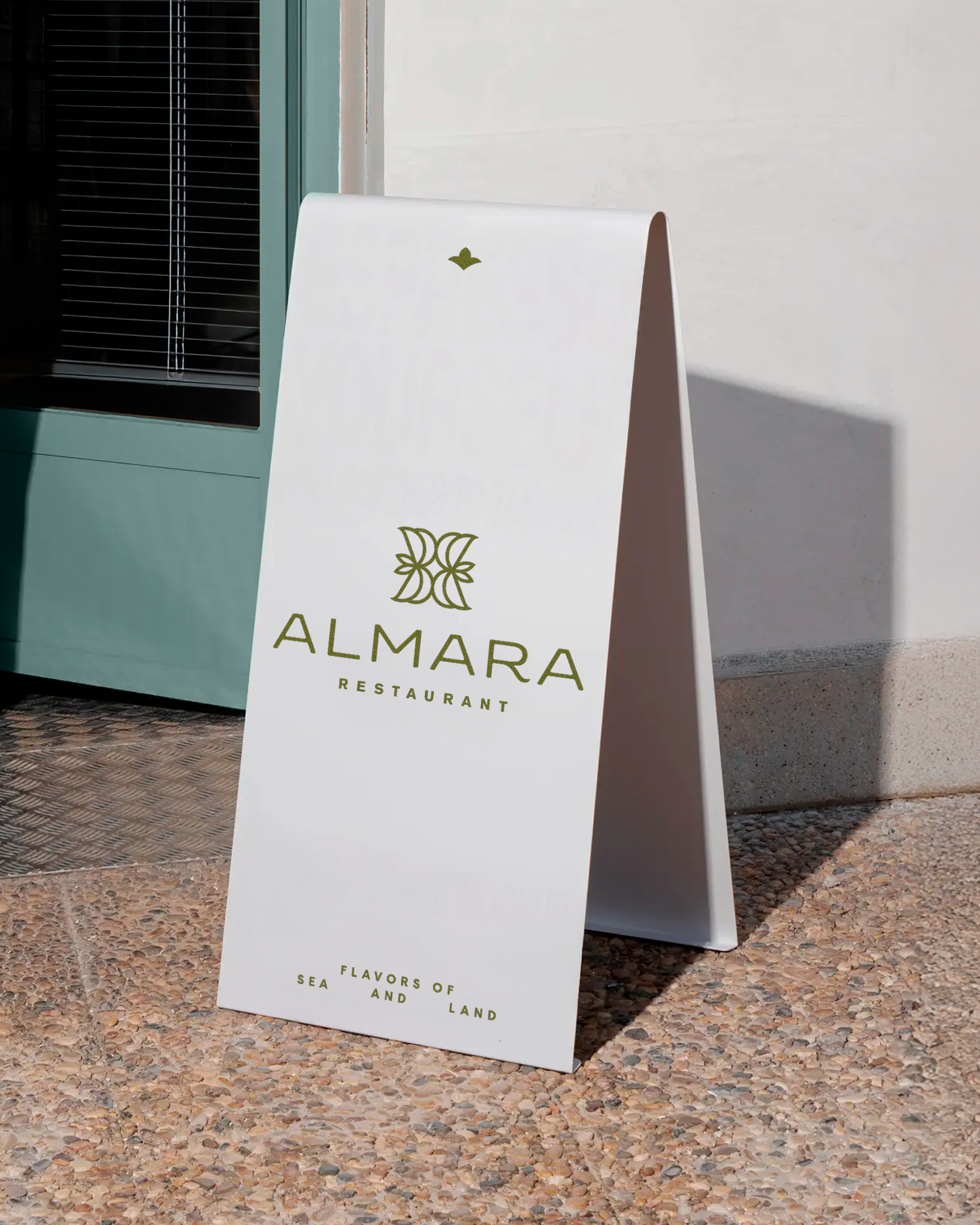
the logo
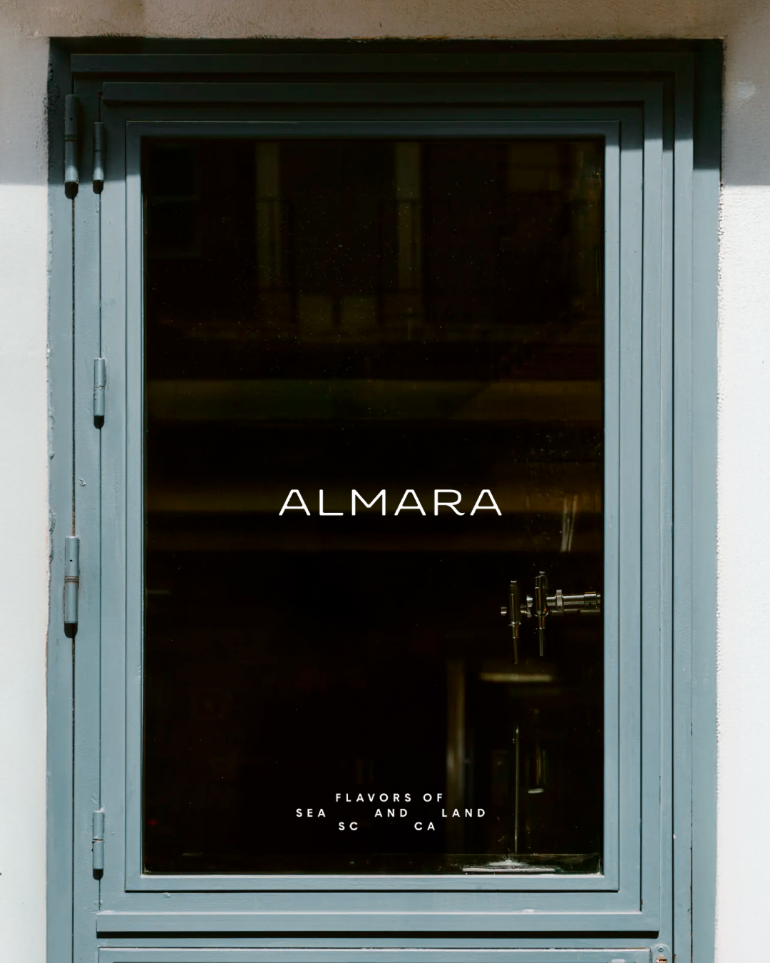
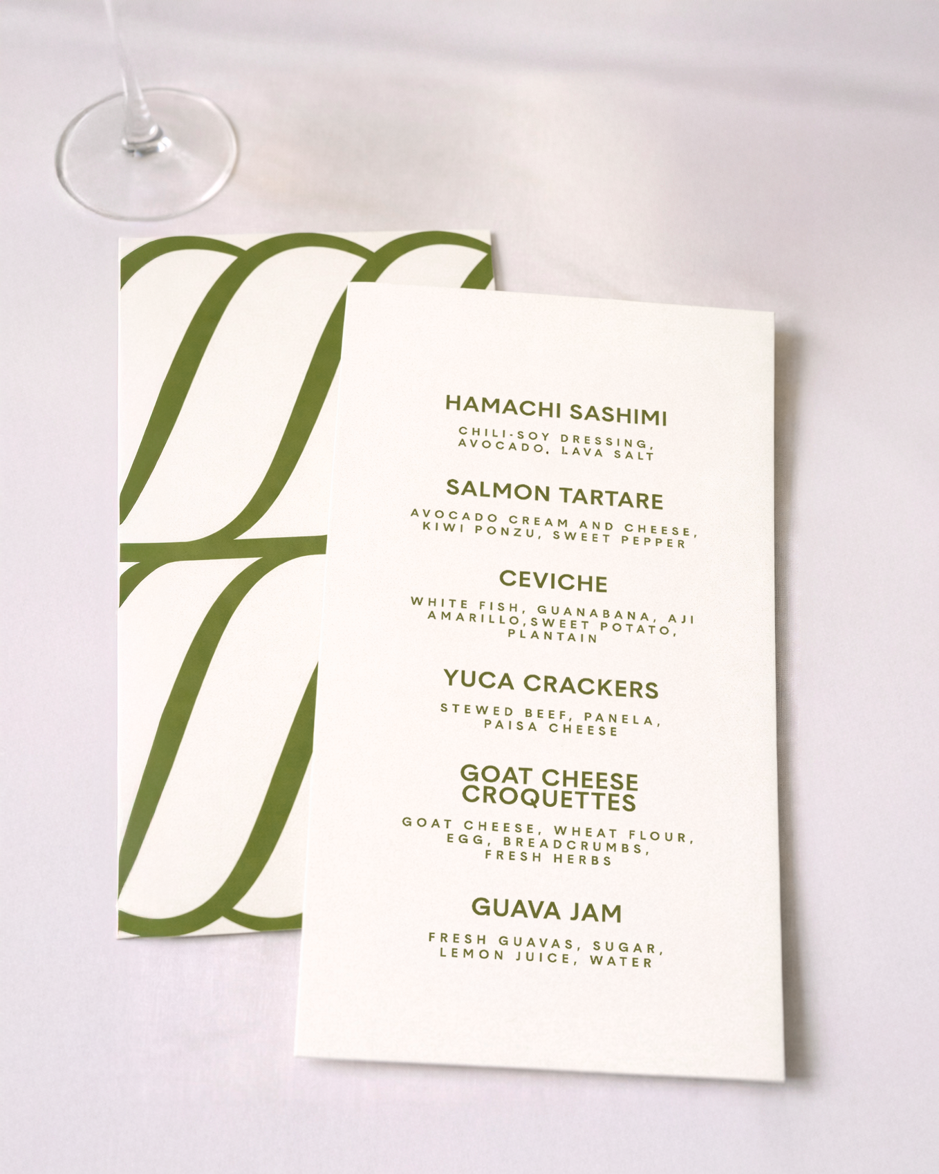
The Almara logo was designed to convey balance, serenity and natural flow.
Its construction is based on softened geometry that avoids rigid angles, resulting in a mark that feels present yet understated.
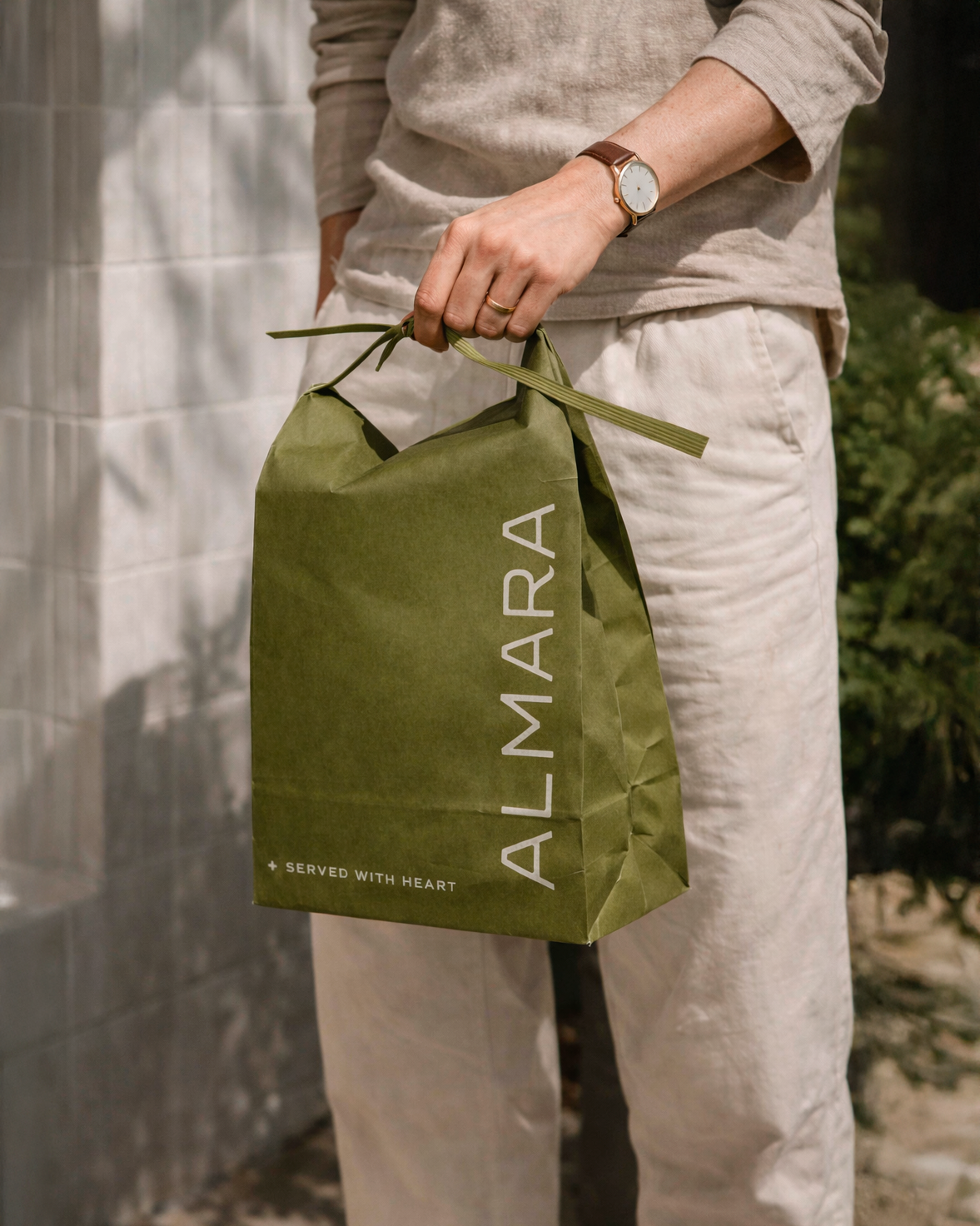
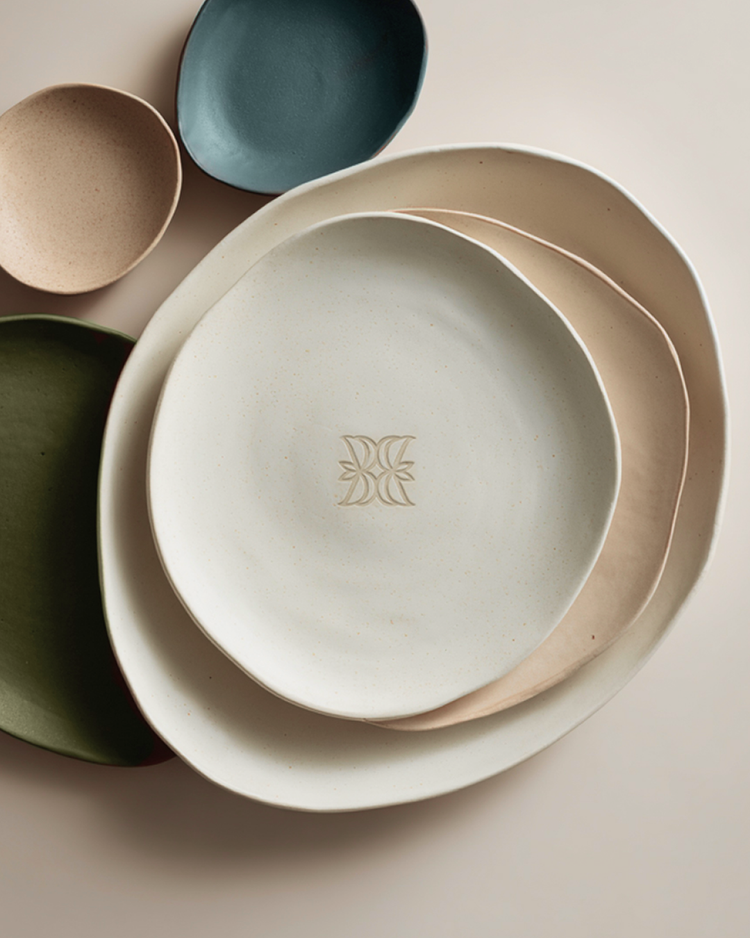
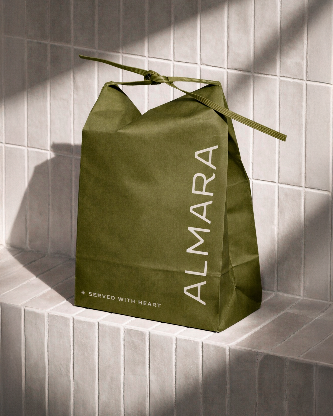
As part of the restaurant visual identity, the symbol works as a flexible element that adapts naturally across menus, ceramics, packaging and spatial applications.
the logo
The Almara logo was designed to convey balance, serenity and natural flow.
Its construction is based on softened geometry that avoids rigid angles, resulting in a mark that feels present yet understated.
As part of the restaurant visual identity, the symbol works as a flexible element that adapts naturally across menus, ceramics, packaging and spatial applications.
naming
The name Almara emerges from the fusion of two words: alma (soul) and mar (sea).
Together they evoke depth, origin and a strong connection with nature.
Within the branding project, the naming functions as the conceptual foundation of the identity, shaping the tone, rhythm and narrative of the entire brand.
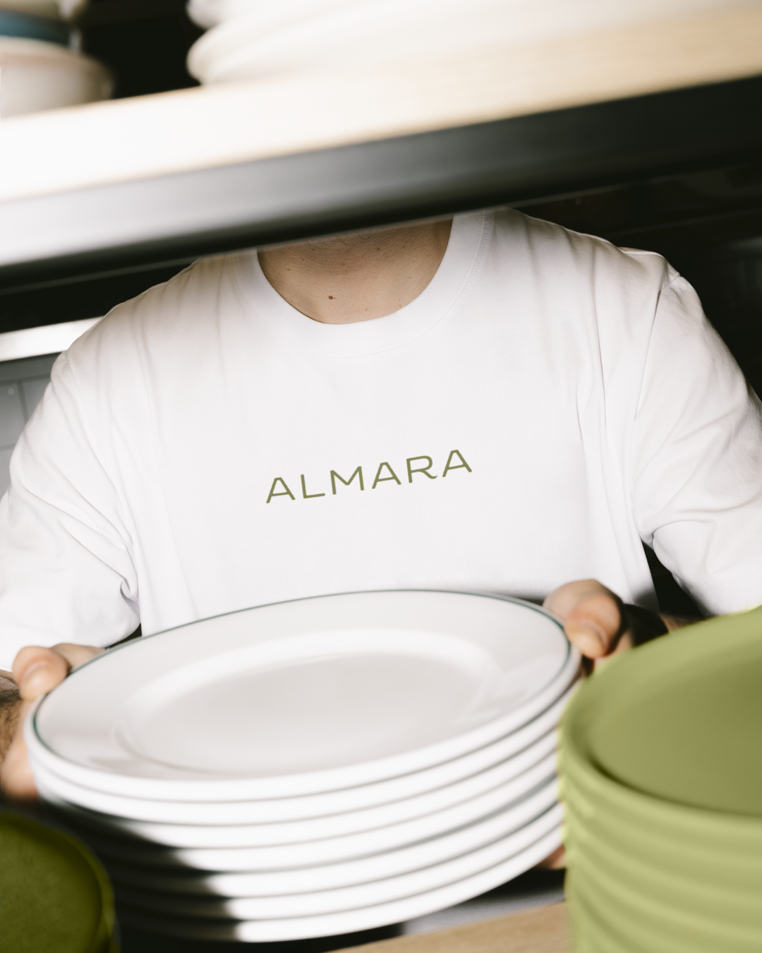
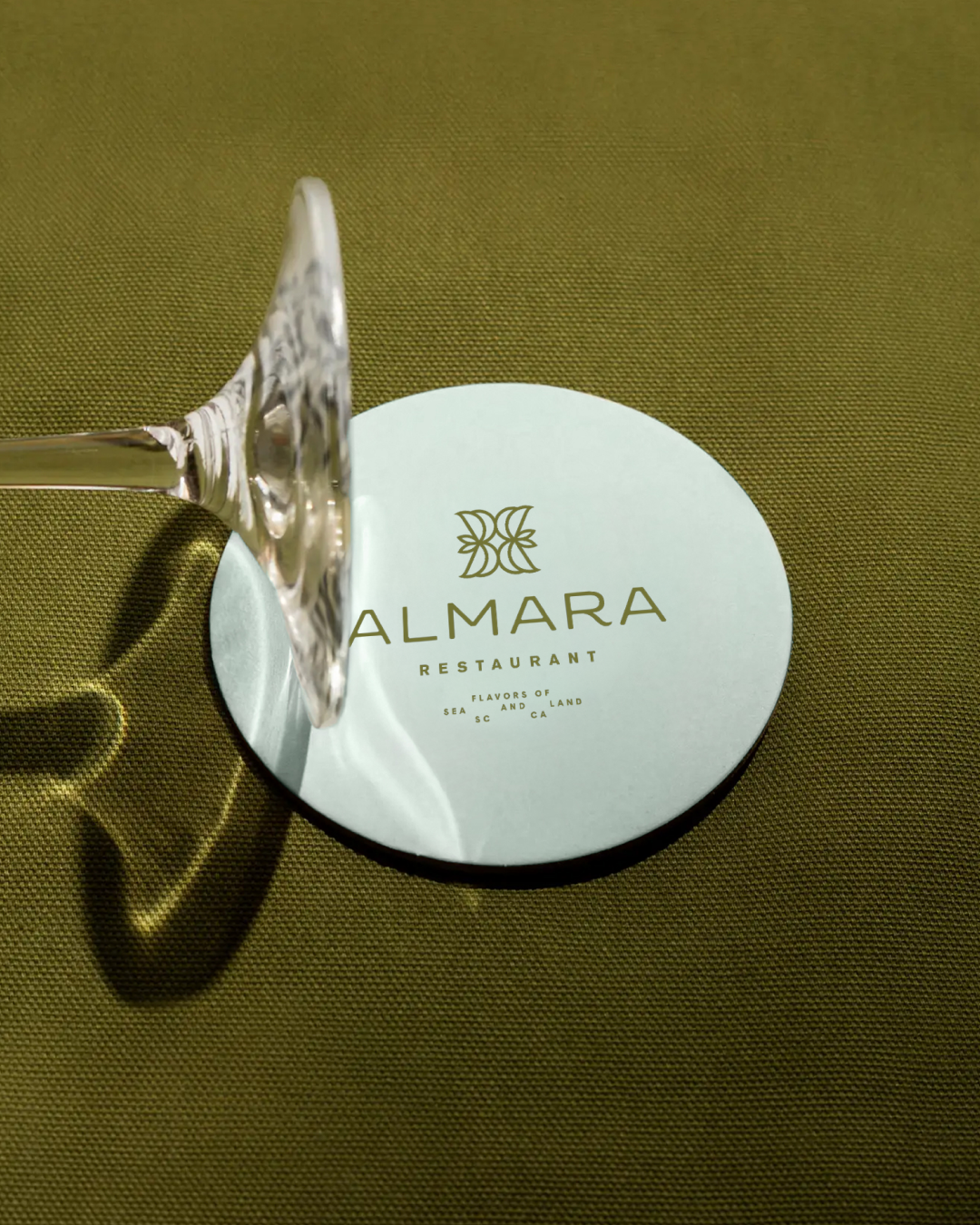

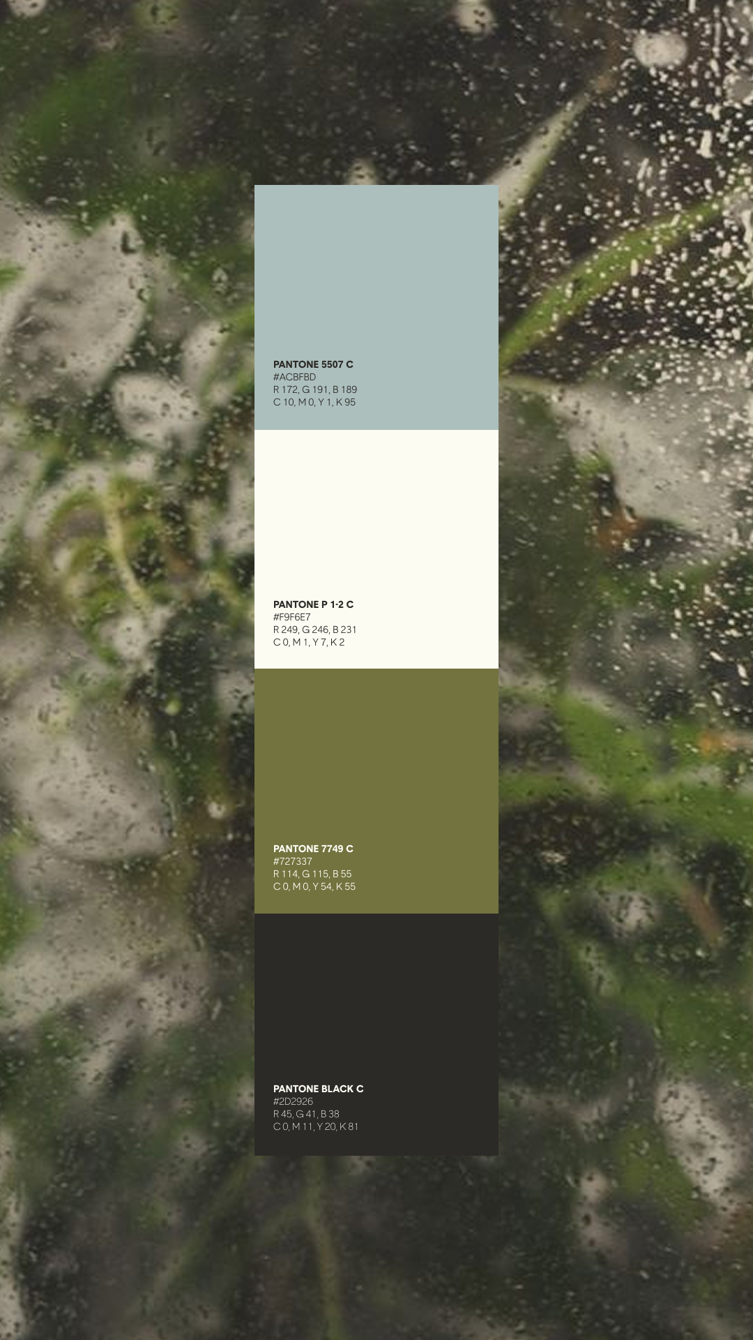
visual language
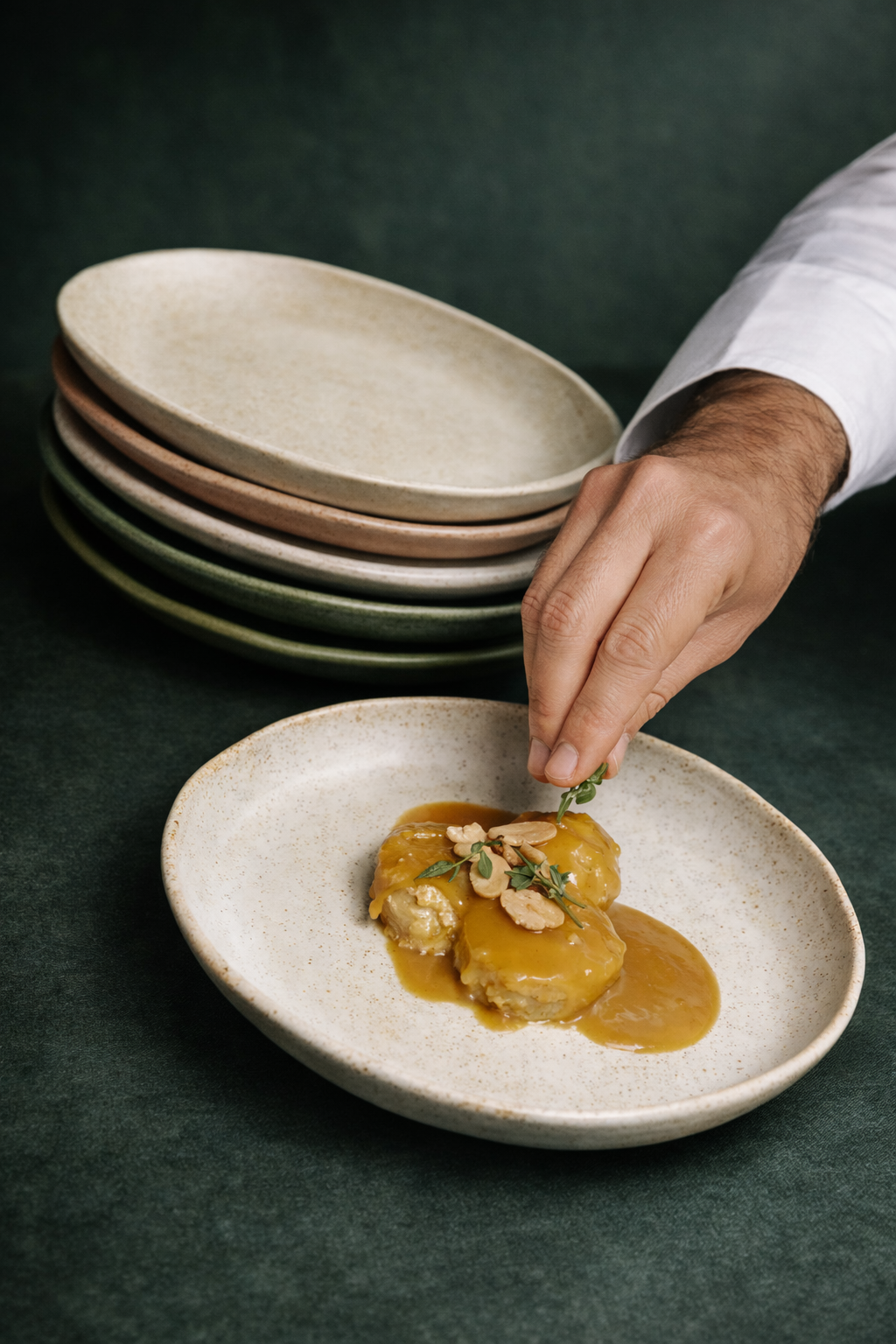
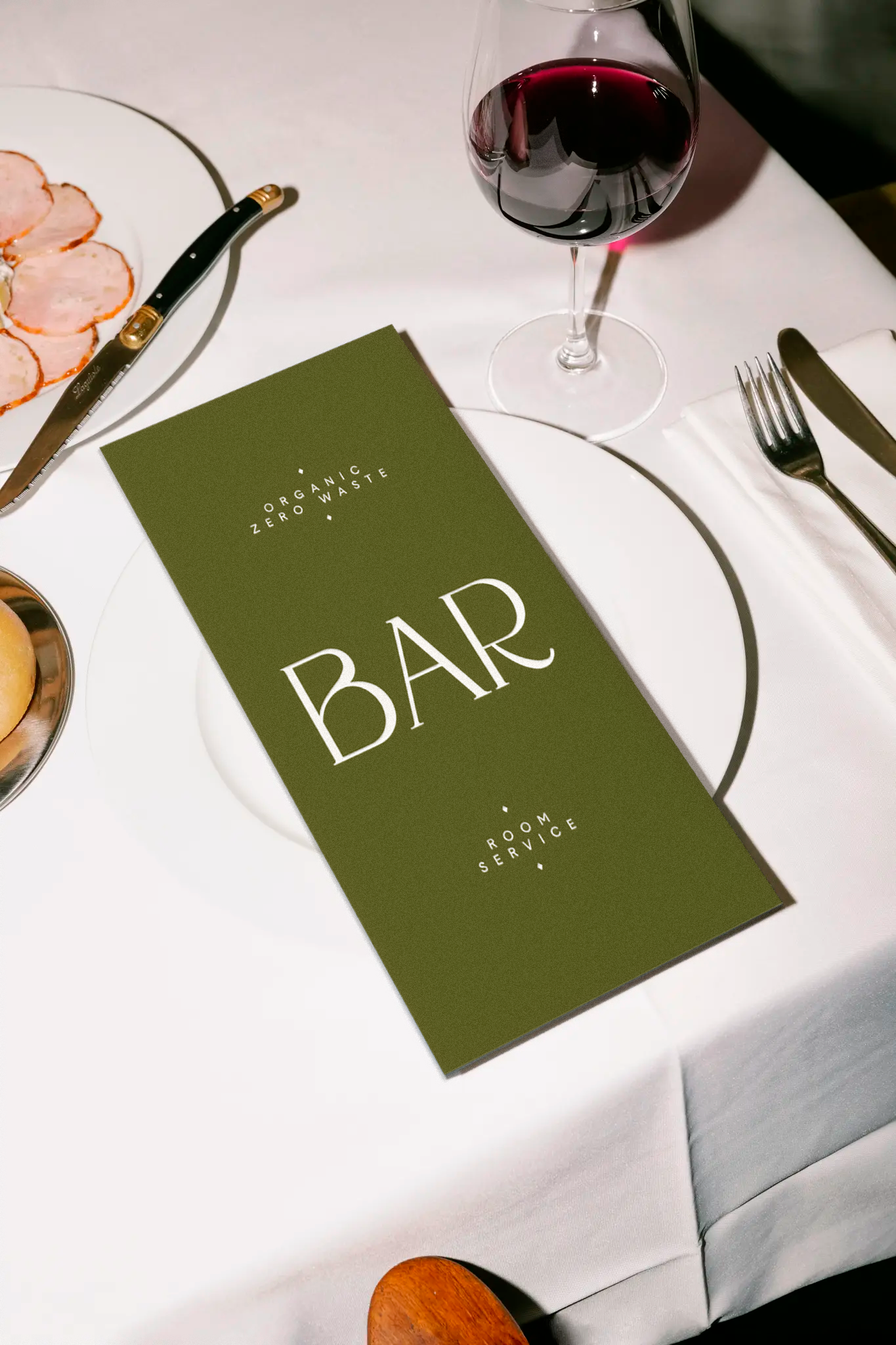
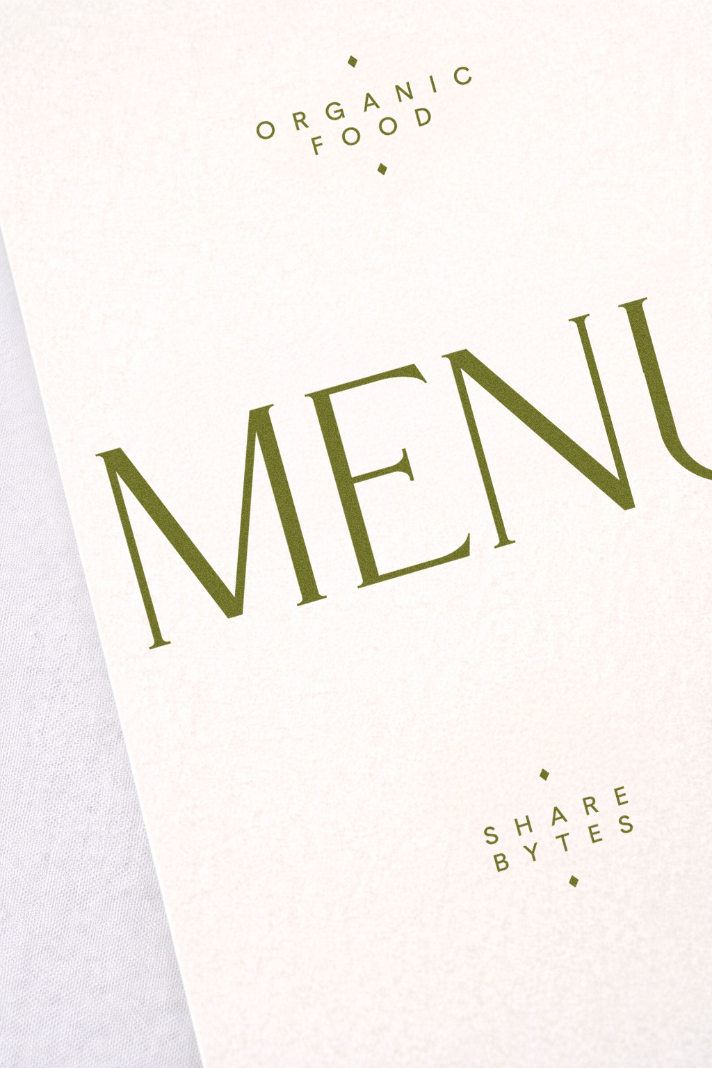
The visual identity system focuses on restraint and material presence.
Soft shapes, balanced compositions and natural tones create a calm visual rhythm aligned with the atmosphere of the restaurant.
This hospitality branding approach allows the identity to live naturally across physical materials such as ceramics, textiles and printed surfaces.
design and strategy: The Croma Studio
client: Case Study